

Overview
USCCU wanted to find a way to continue to grow their membership base in the greater LA area while still being true to their roots – The University of Southern California. They came to Pannos looking for a new website, one that would help them be more accessible to the USC community while showcasing their support for the Los Angeles region as a whole. As part of a university, the credit union wanted members to think of them not only as a financial service provider, but also as an educational resource.
Services used on this project
- web design
Project Goals
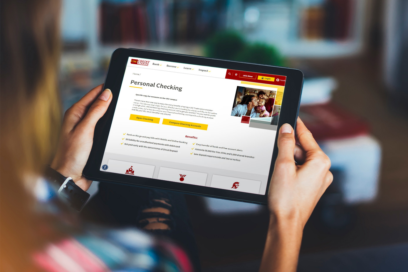
The Ask: Create a new website that shows USCCU serves all members of their surrounding community, whether they’re a USC employee, student, or simply not affiliated with the school at all. USCCU asked Pannos to reduce the amount of content on their current website and focus on the different ways they show support for their community while educating all users on responsible finance practices. Finally, to become more accessible to the communities they serve, USCCU asked that the whole website be translatable into Spanish.
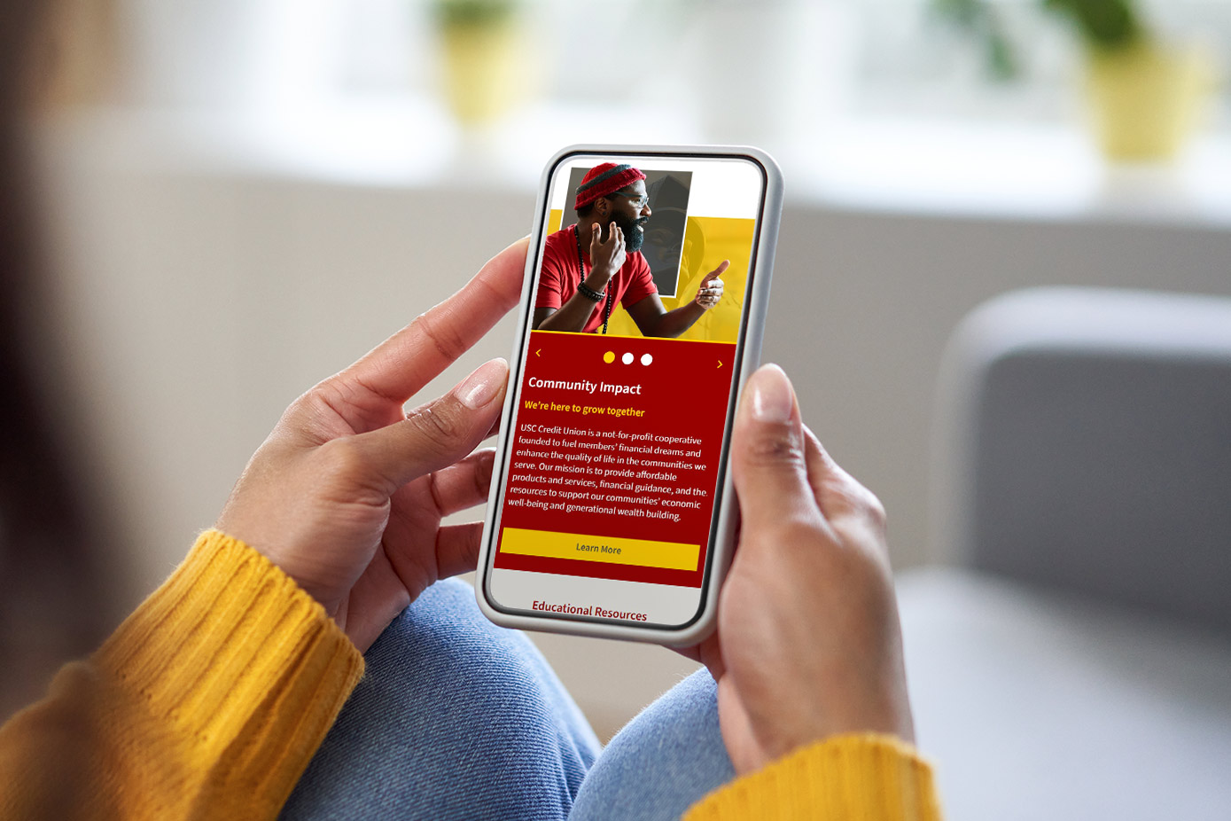
The Answer: Create a website with easier navigation, reduced content, vibrant, community-focused imagery and design, and a connection to the greater LA region through language, educational services, and spirit.
The Answer: Create a website with easier navigation, reduced content, vibrant, community-focused imagery and design, and a connection to the greater LA region through language, educational services, and spirit.

Process
Pannos began the process by holding in-depth discovery calls with USCCU where they dove into the pain points of the current website, the goals for the new website, and how to satisfy the needs of the community through educational, snackable content for the modern-day consumer.
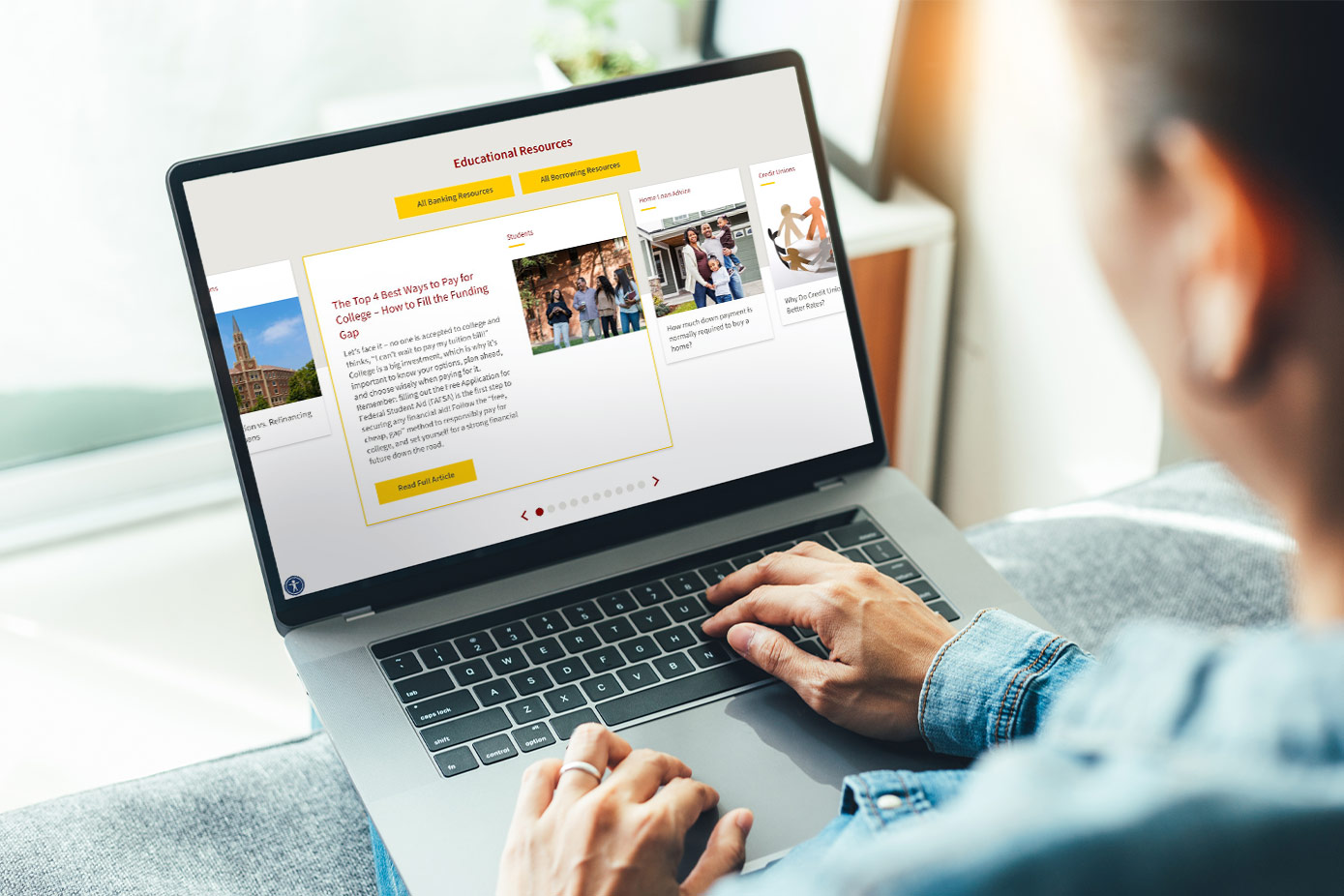
To show they’re a great resource for those affiliated with USC and those living in the surrounding communities, we implemented educational tools such as a blog, educational carousel, colorful overlays that influenced the amount of content presented to the reader, and a CMS that allowed the whole site to be fully translated into Spanish.
To show they’re a great resource for those affiliated with USC and those living in the surrounding communities, we implemented educational tools such as a blog, educational carousel, colorful overlays that influenced the amount of content presented to the reader, and a CMS that allowed the whole site to be fully translated into Spanish.


Results
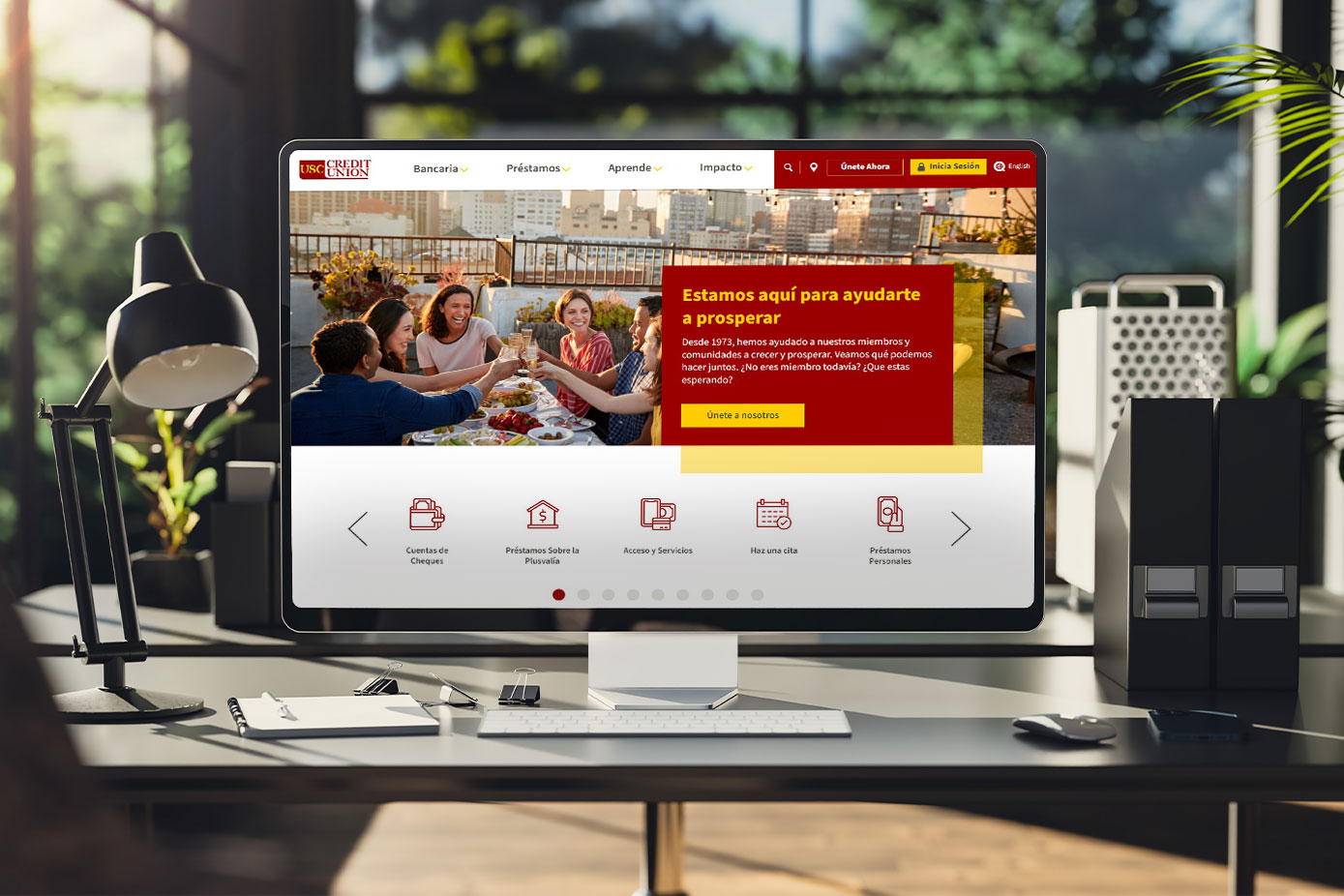
A bright, colorful website that uses innovative design, bite-sized content, and a wealth of educational resources to strengthen the credit union’s ties to their community. Not only was the end result more accessible to community members through the use of English-Spanish translation across the entire site, but also through a personalization capability that now enables USCCU to market specifically to anyone who comes to the site from a USC associated IP address.
Slide the center arrows to toggle between the English and Spanish versions of the website.
Slide the center arrows to toggle between the English and Spanish versions of the website.

Like what you see?
We can do the same for you.
