

Overview
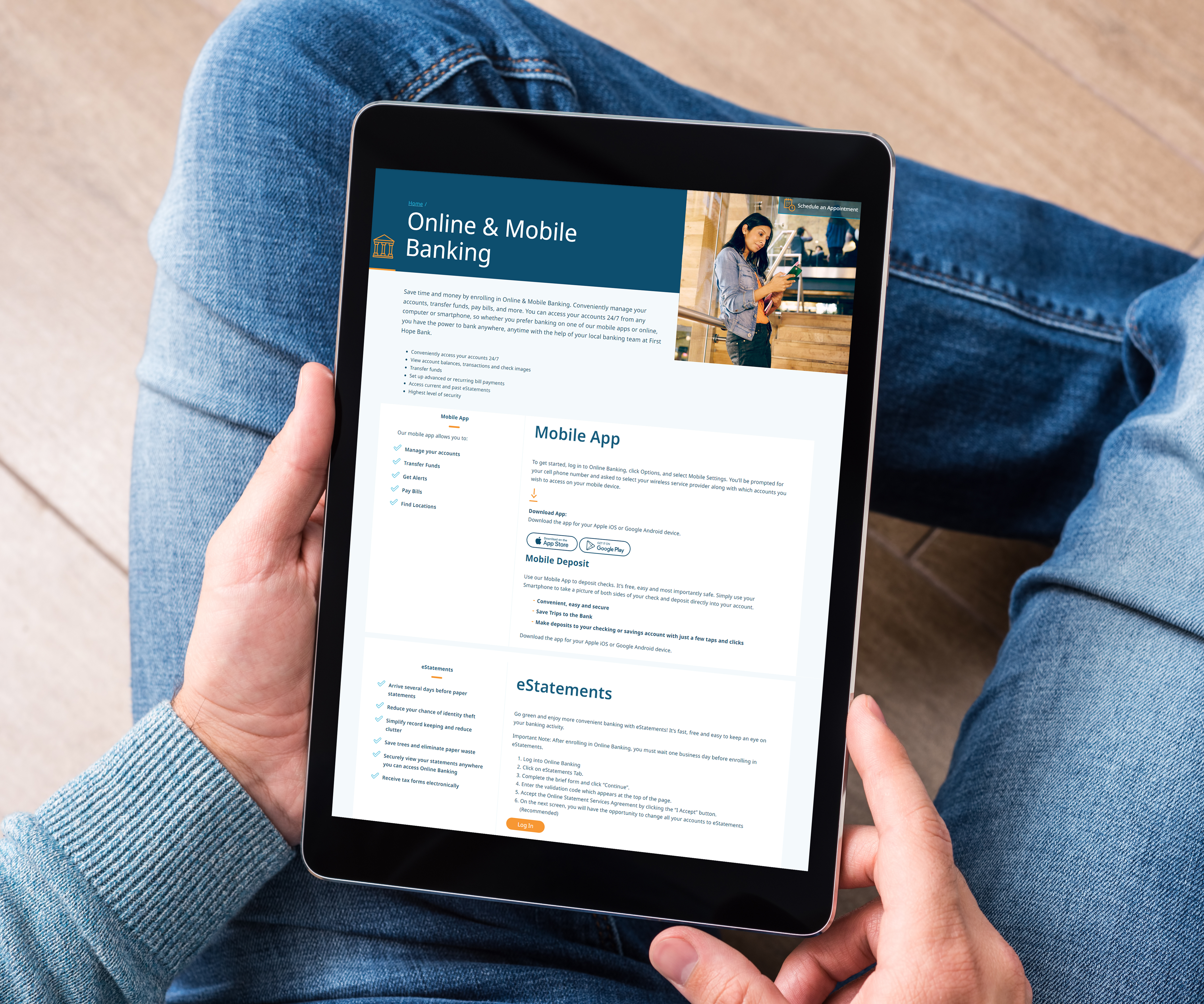
First Hope Bank asked Pannos to redesign their website for a modern look and feel. The Bank wanted to utilize new technologies, and have a site that was fresh and easy-to-navigate.
Services used on this project
- web design
Project Goals
The Ask: Help First Hope Bank in its mission to act as a financial partner to its customers, with an educational, seamless online experience and enhanced online capabilities.
The Answer: A new website with clean navigation that focuses on the customers’ needs and experience, and creates a more contemporary image for the Bank’s brand.
The Answer: A new website with clean navigation that focuses on the customers’ needs and experience, and creates a more contemporary image for the Bank’s brand.

PROCESS
We began with multiple discovery sessions, which provided a deep dive into the Bank’s identity and aspirations. We talked through all their priorities for their website and for the customer experience, and worked collaboratively on even the smallest elements of the new site.
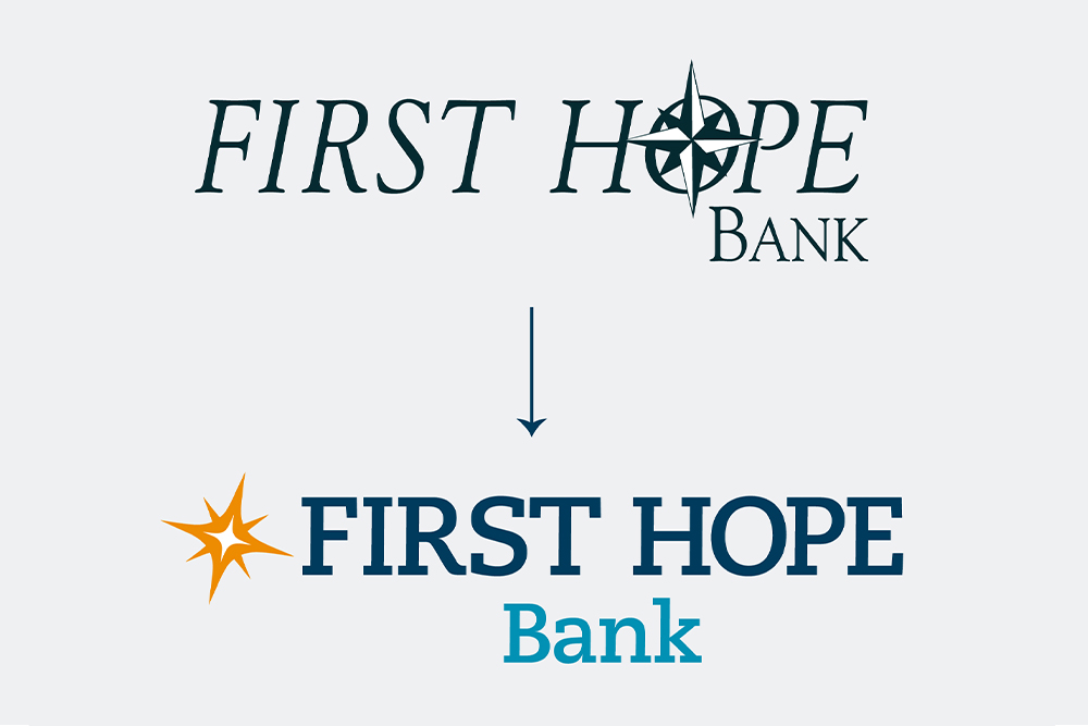
Our design team gave the website and logo a revamp that still felt true to First Hope Bank, with fresh colors, dynamic, modern, inspirational photography, and the all-important star still shining from the logo.
Click here to read more about our modernized logo redesign for First Hope Bank.
Our design team gave the website and logo a revamp that still felt true to First Hope Bank, with fresh colors, dynamic, modern, inspirational photography, and the all-important star still shining from the logo.
Click here to read more about our modernized logo redesign for First Hope Bank.


RESULTS
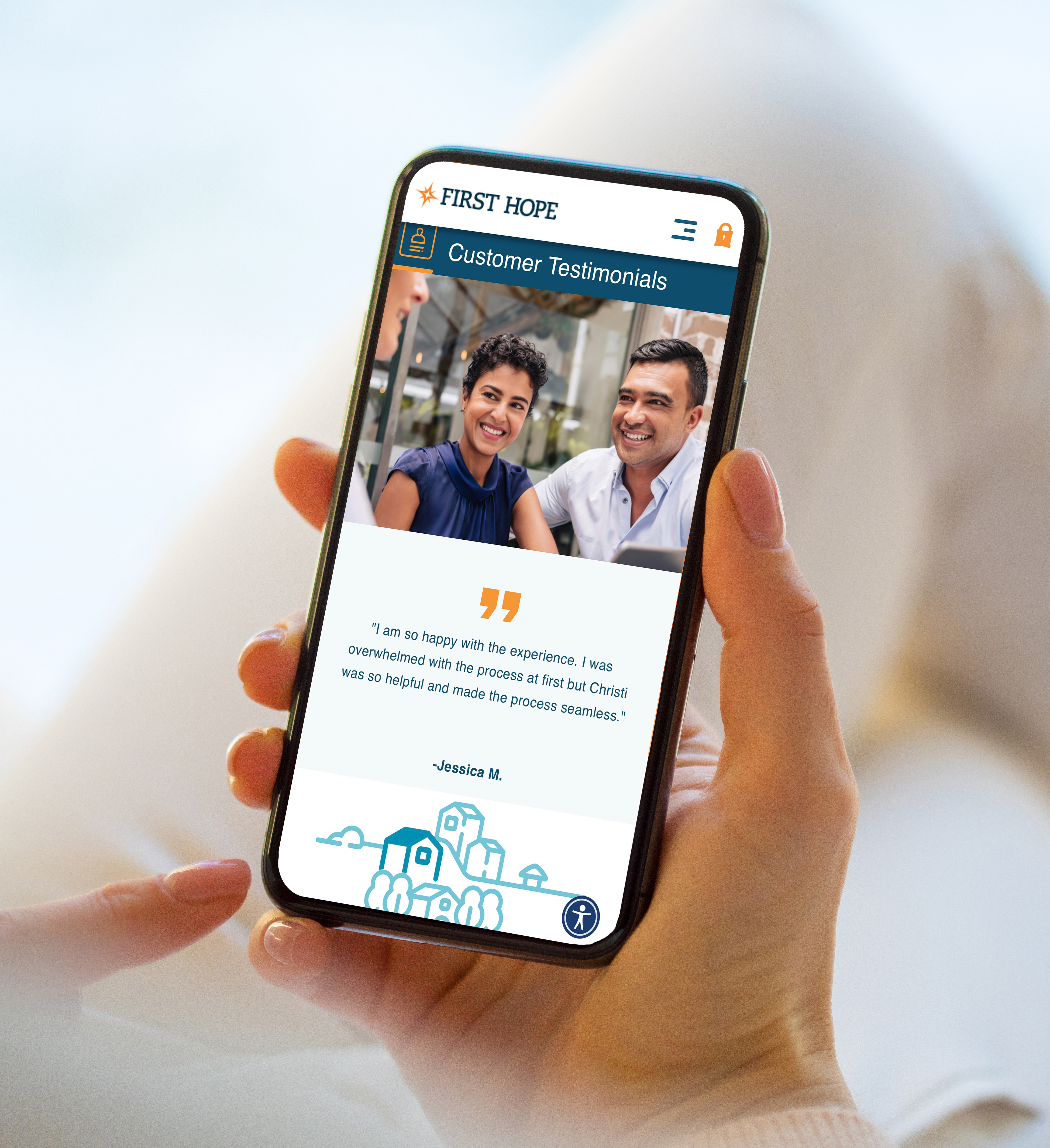
The new website gives a local bank with a distinguished history a vibrant, modern feel. Enhanced educational content, calculators, and financial tools are easily accessible, and strong testimonials are prominently placed with pride.
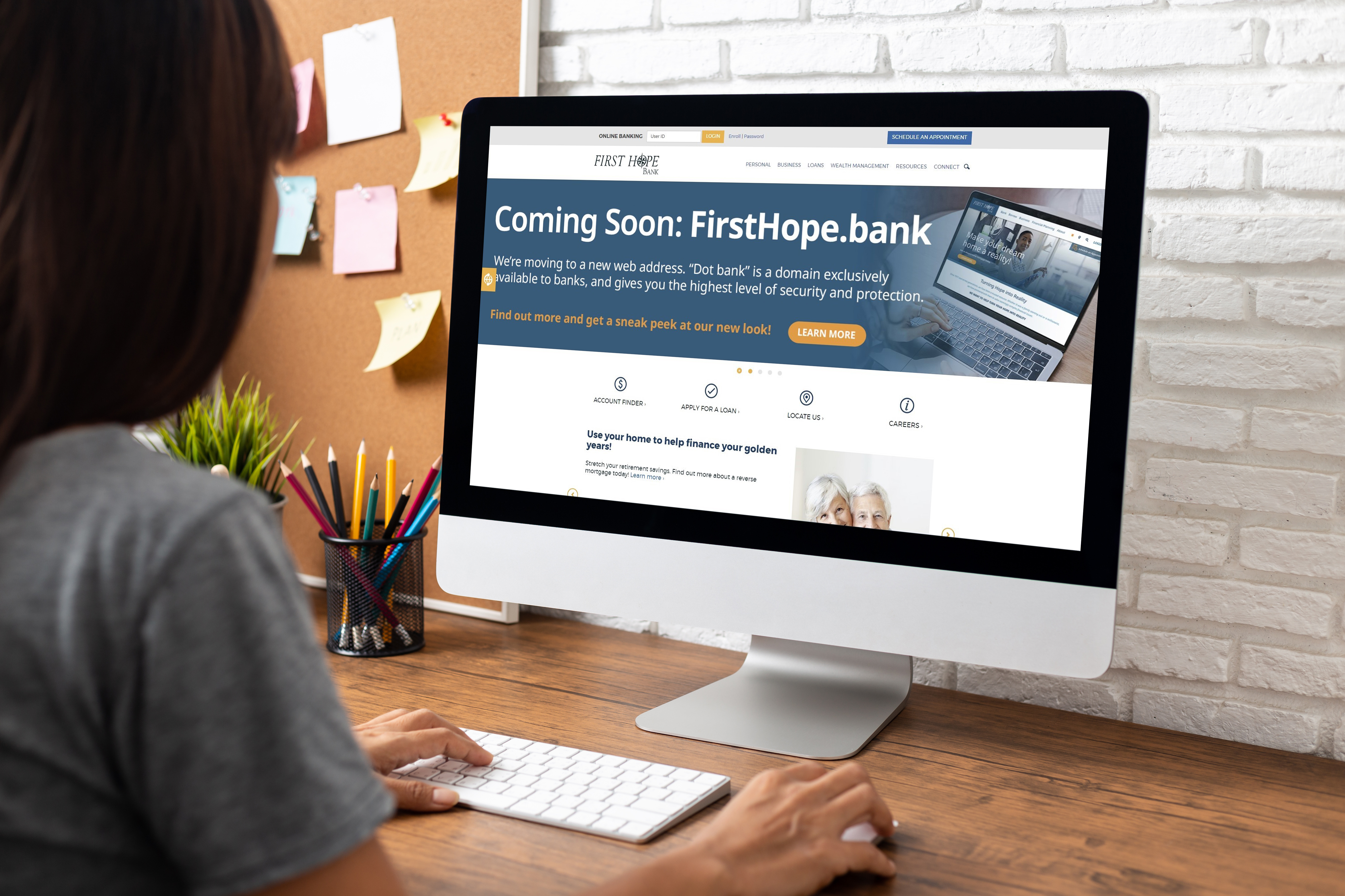
Slide the center arrows to see the before and after versions of the website.
Slide the center arrows to see the before and after versions of the website.

Like what you see?
We can do the same for you.
