

Overview
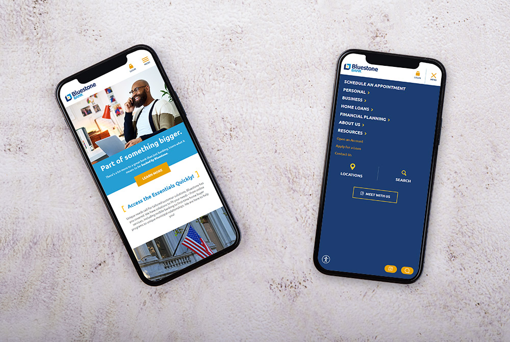
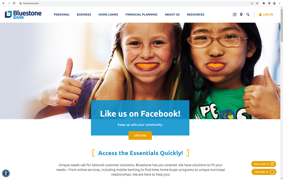
Neither the Bridgewater Savings Bank nor Mansfield Bank websites could be reskinned and accomplish all that the bank needed from their website. As a recently merged bank, the new branding, products and combined teams solidified the need to start fresh. Bluestone Bank knew that the site also needed to appeal to and speak to all generations, which meant leveraging drop-down menus, bold colors and imagery to make information easy to find and understand. The site also needed to be able to grow with the bank and provide options for future customization.
Services used on this project
- Web Design
- Content Management
- Hosting
- SEO
- Analytics
- Online Visibility
Let the Numbers Tell the Story
48%
increase in new website visitors
53%
increase in sessions
44%
increase in pageviews
Project Goals
The Ask: The merger of Bridgewater Savings Bank and Mansfield Bank resulted in their new brand, Bluestone Bank. As part of it's unveiling, the newly formed bank needed a website that would clearly represent the Bluestone personality and bring its online branch to life and effectively tie both bank communities together.
The Answer: Create an engaging website that accurately reflects the new brand and combined markets. Additionally, setup the new bank for future growth through deepening share of wallet and market penetration with seamless, streamlined navigation and user experience.
The Answer: Create an engaging website that accurately reflects the new brand and combined markets. Additionally, setup the new bank for future growth through deepening share of wallet and market penetration with seamless, streamlined navigation and user experience.


Process
We started the process by holding in-depth discovery sessions with the bank. Armed with the insights gained during discovery, we worked collaboratively to craft a streamlined user experience made to reflect the brand direction. Our top priority was to build a site that brought the new brand to life that was mobile-first and designed with future growth in mind.
In reviewing CMS options with the bank, we determined that Kentico was the best option, as it would allow for a “phase 2” that would include advanced personalization through personas and scoring, tied to an internal CRM. Additionally, convenient features such as live chat and appointment scheduling were featured to allow customers and prospective customers to communicate in the way that is best for them.
In reviewing CMS options with the bank, we determined that Kentico was the best option, as it would allow for a “phase 2” that would include advanced personalization through personas and scoring, tied to an internal CRM. Additionally, convenient features such as live chat and appointment scheduling were featured to allow customers and prospective customers to communicate in the way that is best for them.


Before and After
To see the transformation, slide the center arrows to reveal the old site on the left and the new site on the right.

Results
We created an expressive, state-of-the-art website that builds on the bank’s brand through the use of simple animation, bright colors, and custom icons and photography. The new website successfully united the two banks and their respective communities. By leveraging a Kentico CMS platform with built-in personalization and marketing automation functionality, Bluestone Bank is poised for the future.

Like what you see?
We can do the same for you.
