Texans Credit Union was created in 1953 as the Credit Union for employees of Texas Instruments. Over the years, Texans expanded its reach to include more members of the community, and stayed true to its “For Texans, by Texans” ethos. As it grew, they understood it was time to reimagine their brand for a new era, and for up-and-coming generations of members.
Services used on this project
- Branding
- Design
- Copywriting
Project goals
The Ask: To develop a fresh new brand, logo, messaging, and visual identity; to position Texans Credit Union as a local, friendly advocate and a technology-forward, expert partner in members’ present and future financial success.
The Answer: Build a brand story that showcases the modern essence of the new brand, and doubles down on what members have always valued about Texans—using a new voice in messaging, visually appealing and consistent design, and a new logo.
The Answer: Build a brand story that showcases the modern essence of the new brand, and doubles down on what members have always valued about Texans—using a new voice in messaging, visually appealing and consistent design, and a new logo.
Process
Pannos began the process of reimaging the Texans brand by leading Discovery Sessions with employees to understand their perceptions, concerns, points of pride, and vision for the future of the CU. Those sessions, along with external research that illuminated Texans’ competition and how Texans is viewed in the marketplace, were a strong foundation to build on.
We uncovered the heart of the Texans brand culture, their true “why.” Then we formed a new expression of the Texans promise to its members—and its ability to offer big-bank solutions with a neighborly, Texas touch. And throughout, working to convey the Texans commitment to doing the right thing—even if it’s not the easy thing.
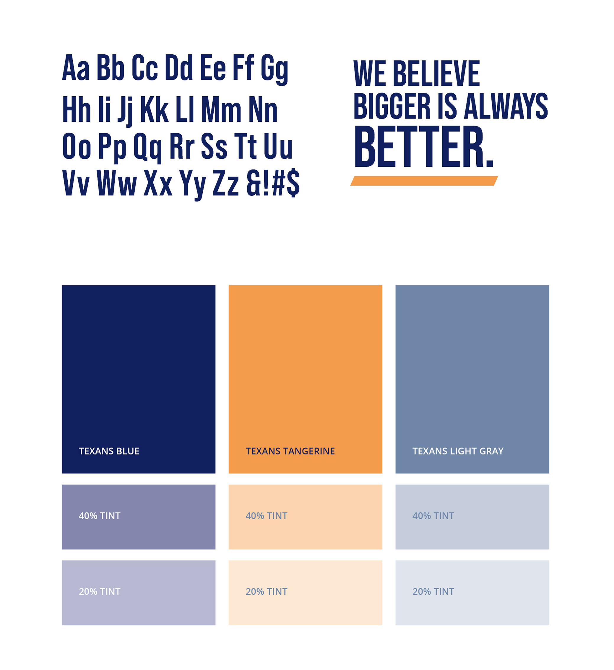
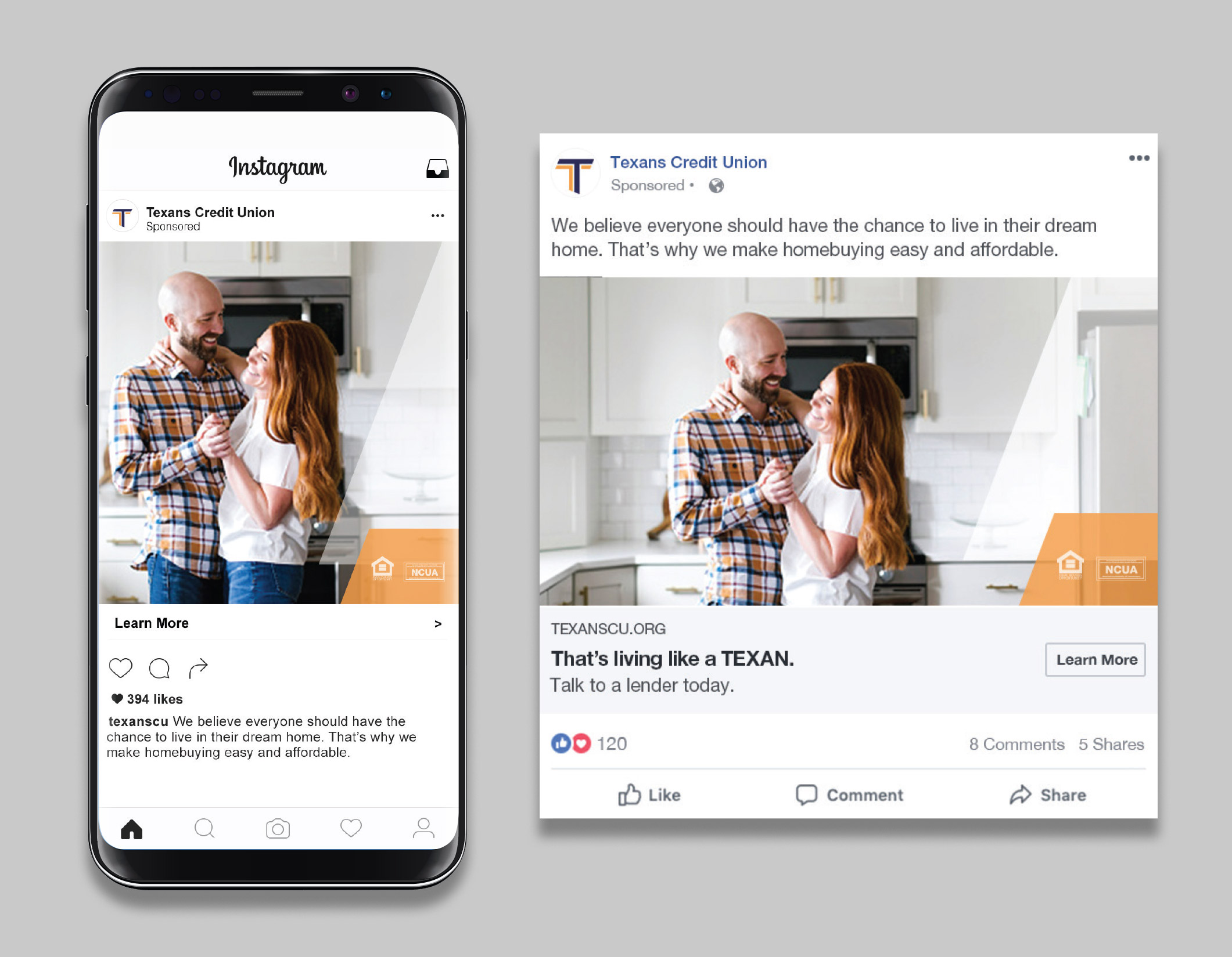
Every element of the brand was transformed. A new logo. A new brand voice and messaging platform. Cohesive, holistic visual brand standards. All in the service of a best-face-forward to their communities, and current and future members.
The messaging of the brand embodies Texans itself: plain-spoken, honest, fair, and helpful. Nothing shallow or showy, just an earnest, friendly promise to do their very best on behalf of every member.
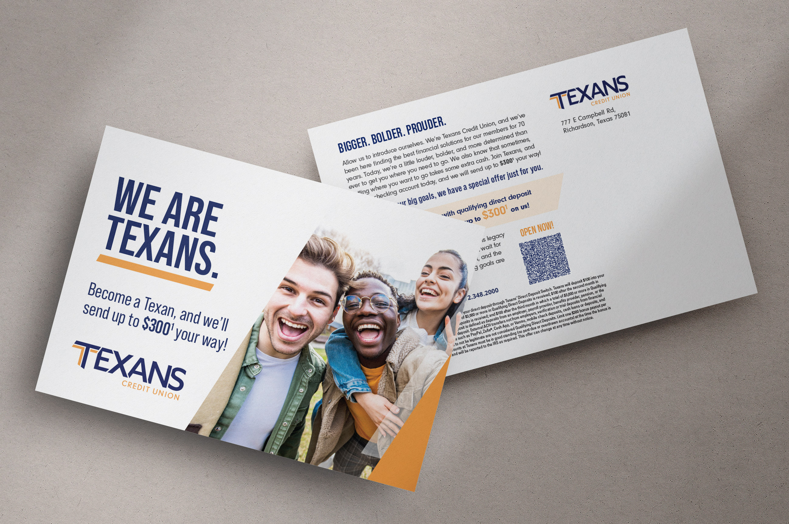
The design team went far beyond “crossing their Ts.” From explorations of fonts, type weights, angles, and color combinations a new, iconic expression of the Texans identity emerged. Once a logo was approved, it was time to ensure the integrity of the brand standards could be upheld across a variety of media.
Next, we applied these newly-minted brand standards to the Texans website, giving it a modern but warm feel, an assurance that the latest technology is always supported by friendly, helpful Texans.
And to ensure everyone at Texans was onboard, we created a video introduction to the brand for employees. It kept them included in the process, and got them excited to be part of the new, modern identity for the place they’re proud of.
We uncovered the heart of the Texans brand culture, their true “why.” Then we formed a new expression of the Texans promise to its members—and its ability to offer big-bank solutions with a neighborly, Texas touch. And throughout, working to convey the Texans commitment to doing the right thing—even if it’s not the easy thing.
Every element of the brand was transformed. A new logo. A new brand voice and messaging platform. Cohesive, holistic visual brand standards. All in the service of a best-face-forward to their communities, and current and future members.
The messaging of the brand embodies Texans itself: plain-spoken, honest, fair, and helpful. Nothing shallow or showy, just an earnest, friendly promise to do their very best on behalf of every member.
The design team went far beyond “crossing their Ts.” From explorations of fonts, type weights, angles, and color combinations a new, iconic expression of the Texans identity emerged. Once a logo was approved, it was time to ensure the integrity of the brand standards could be upheld across a variety of media.
Next, we applied these newly-minted brand standards to the Texans website, giving it a modern but warm feel, an assurance that the latest technology is always supported by friendly, helpful Texans.
And to ensure everyone at Texans was onboard, we created a video introduction to the brand for employees. It kept them included in the process, and got them excited to be part of the new, modern identity for the place they’re proud of.

Results
A contemporary, polished brand that sets Texans apart from the competition. A brand that forges a new road ahead, and moves into the future of Texans Credit Union with a spotlight on their true, strong, member-centric ethos and identity.
Like what you see?
We can do the same for you.