Big, Bold Typography and a Credit Union
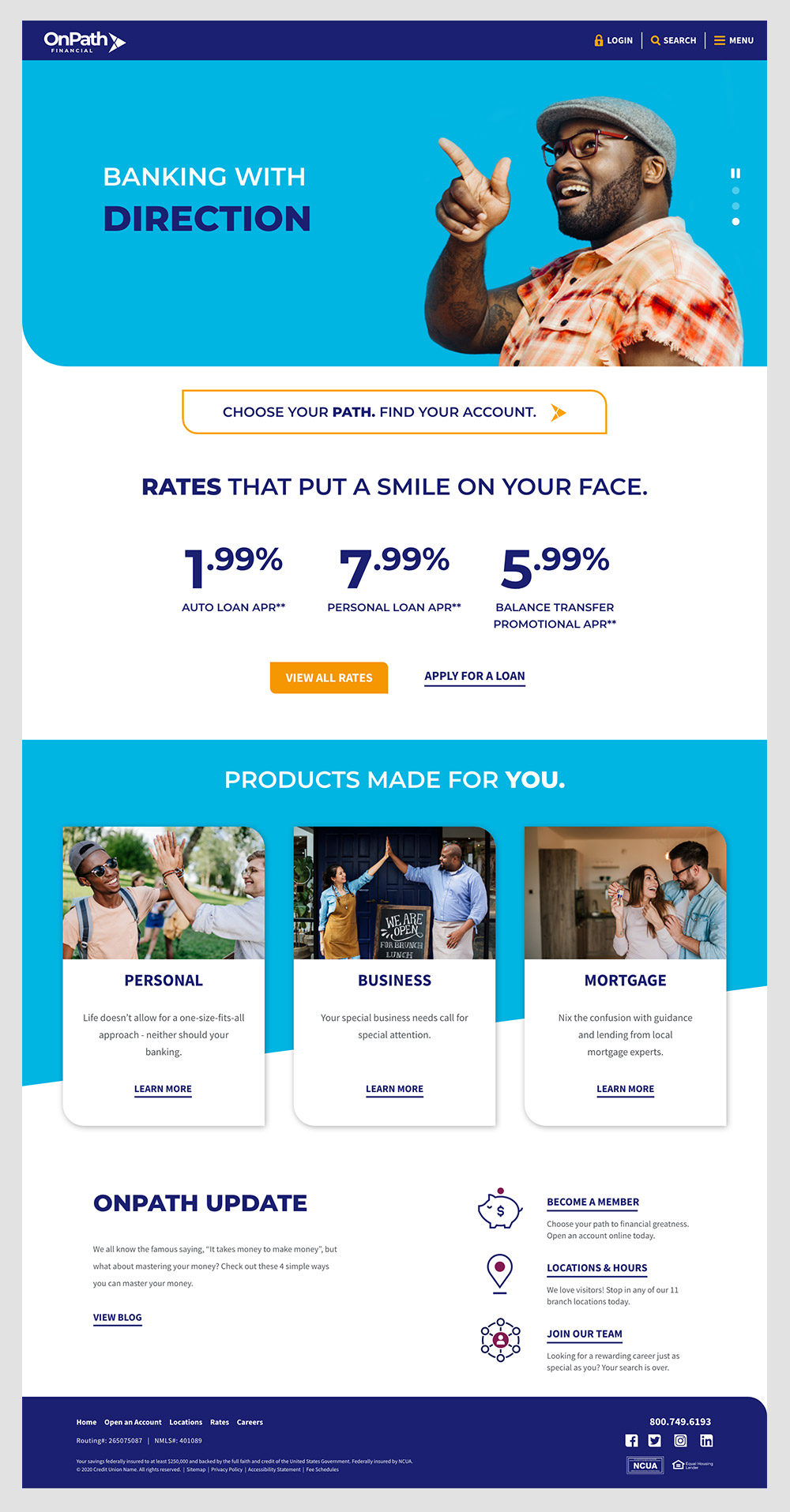
OnPath Federal Credit Union came to Pannos with a new brand that they wanted to bring to life through a new and bold website. The credit union wanted their website to be reflective of the diverse community they serve.
Big and Bold
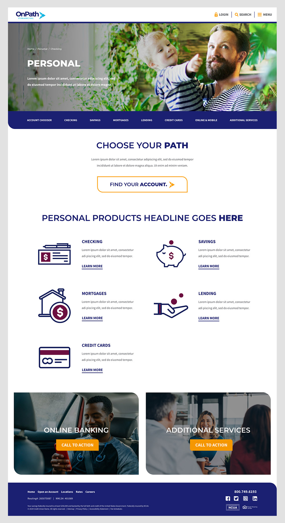
The credit union launched their site with big, bold and colorful typography, imagery, shapes and color. They wanted the imagery to focus on people doing what they do. Each element came together to hone in on their personality. The homepage was a mix of products and community. Pannos used fun animations to add a splash of interactivity.
To help promote the new website, its designs and modern features, the credit union opted to include a tour in their website launch. The new website tour pops up to highlight the important items within the navigation, making the transition to the new site as easy as possible for new and existing users.

Like what you see?
We can do the same for you.