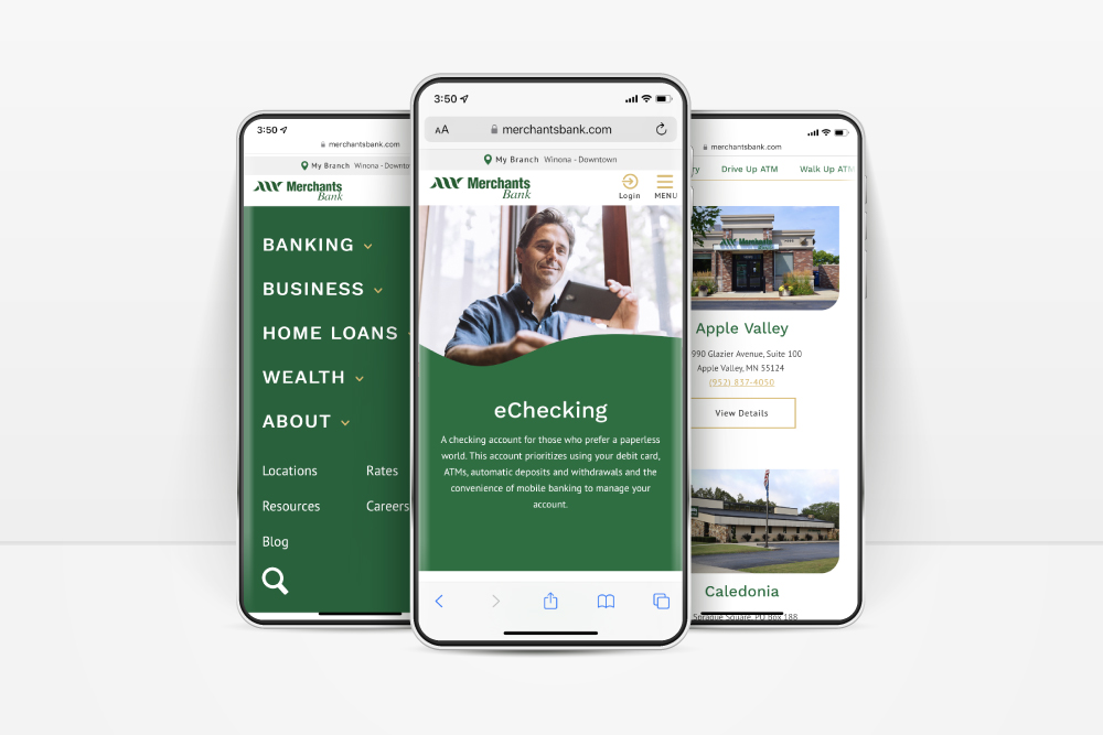


Overview
Merchants Bank’s mission has always been to be the financial partner of choice,
striving to help customers and communities fulfill their hopes and dreams. The bank came to
Pannos looking for a way to better convey their message throughout their website, and to
provide a better user experience for their customers and prospects.
Services used on this project
- Web Design
Project Goals
The Ask: Refresh the Merchants Bank website in a way that showcases their connection to the
community, the core values of the bank, and provide a streamlined experience for their website users.
The Answer: An intuitive website that highlights the bank’s brand, message, and community commitment across all pages and makes it easier for prospective customers to convert.
The Answer: An intuitive website that highlights the bank’s brand, message, and community commitment across all pages and makes it easier for prospective customers to convert.

Process
Pannos and Merchants Bank started the new website process by holding in-depth
discovery calls to identify what was working on their old site, and what they wanted to improve
for their new site. Leveraging eye-catching design that pays tribute to their rope logo
throughout the website, Pannos was able to deliver an engaging site full of playful imagery,
custom icons, and concise, powerful content that stays on-message with the Merchants Bank brand.

Before and After
To see the transformation, slide the center arrows to reveal the old site on the right and the new site on the left.

Results
A fun, creative, and streamlined website that enhances the user experience, highlights the bank’s roots and their ties to the community through modern design elements and clear, concise content.

Like what you see?
We can do the same for you.
