Overview
From fun events that bring neighbors together to branches that make everyone feel at home, Maspeth Federal Savings has been a true fixture of the Queens, New York Community since 1947. Generations of local customers have turned to Maspeth for customized products and transformational customer service. But the bank knew it was time to enhance their technology offerings and reimagine their brand to attract young customers—and continue to help as many neighbors as possible live their best lives.
Services used on this project
- Branding
- Web Design
- Copywriting
project goals
The Ask: Create a new brand for Maspeth that modernizes the bank’s image, upholds its already established reputation as a caring, dedicated local financial advocate, and showcases its commitment to technology-forward innovation to take you into a successful financial future.
The Answer: Build a brand story on the foundation of trust and know-you-from-the-neighborhood friendliness that Maspeth has earned in the Queens, New York Community. Use urban-centric, approachable design, a new logo, and a clear, caring brand voice to communicate the bank’s value as a financial partner for every generation and its commitment to innovation and technology.
The Answer: Build a brand story on the foundation of trust and know-you-from-the-neighborhood friendliness that Maspeth has earned in the Queens, New York Community. Use urban-centric, approachable design, a new logo, and a clear, caring brand voice to communicate the bank’s value as a financial partner for every generation and its commitment to innovation and technology.

process
Maspeth’s strong internal culture and warm, nurturing work environment came through when Pannos sat down for Discovery Sessions with bank employees. Backed by external research and deep insights into the demographics of the bank’s service areas, Pannos got to work—staying true to the bank’s culture and values, while enhancing the look and voice that to showcase Maspeth’s dedication as an innovative leader to everyone in their community.
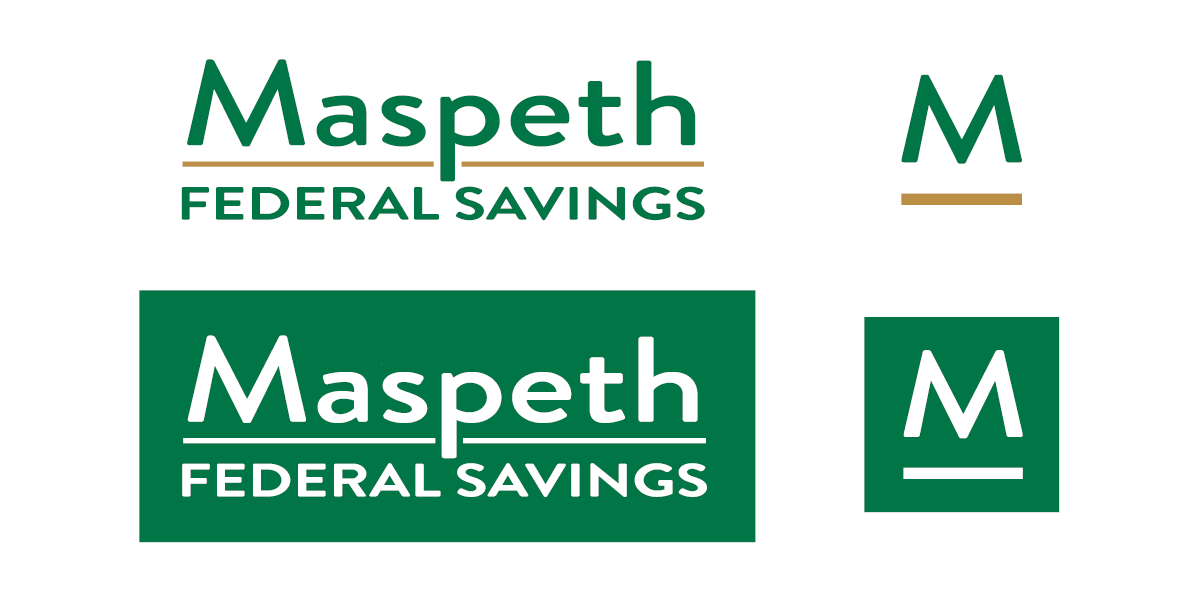
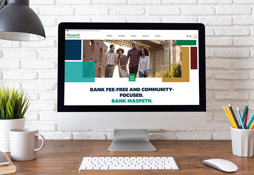
The logo is at the heart of the Maspeth Brand. The M is the hero element, connecting to the Queens community and leading the bank and its neighbors forward.
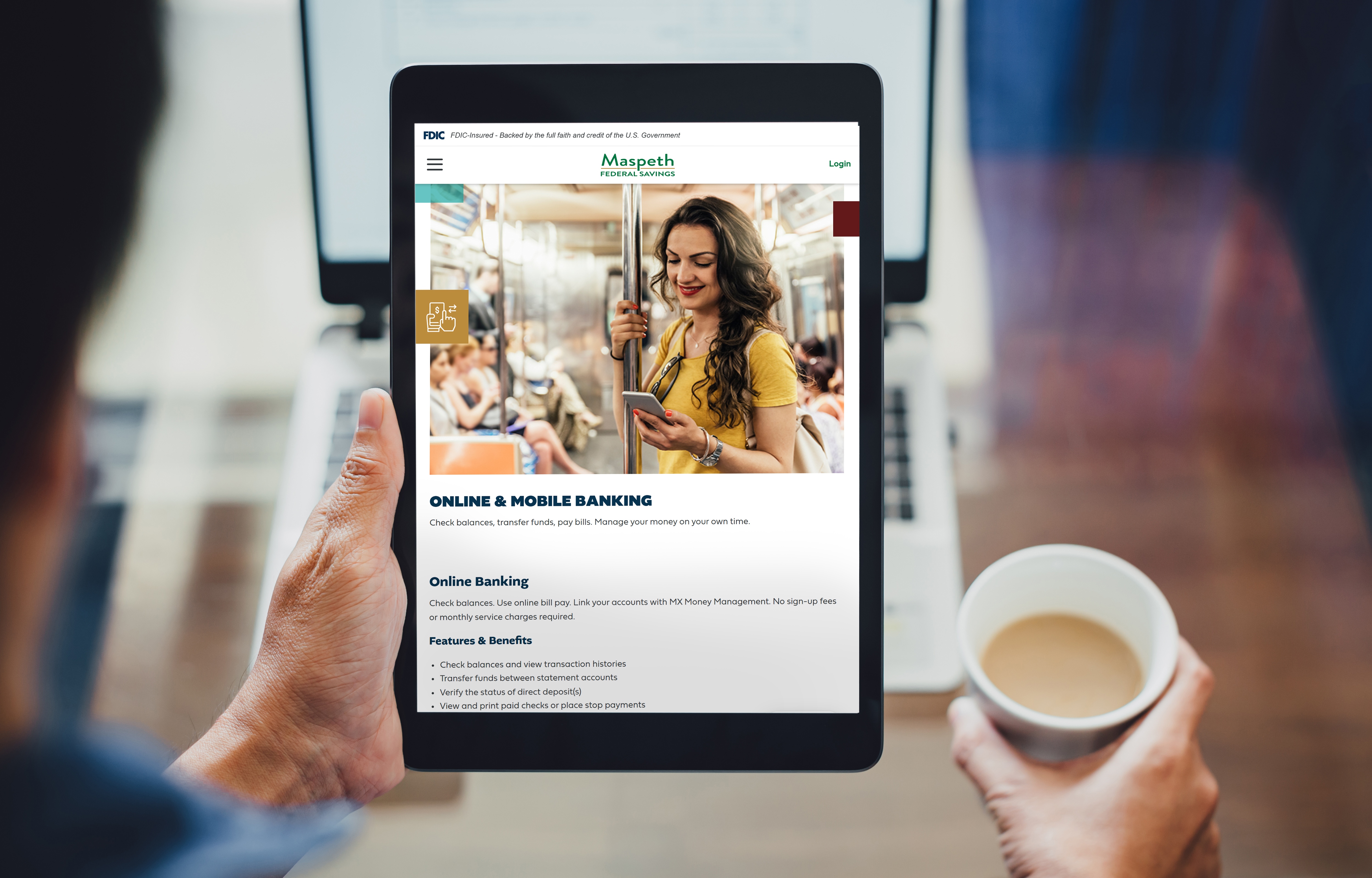
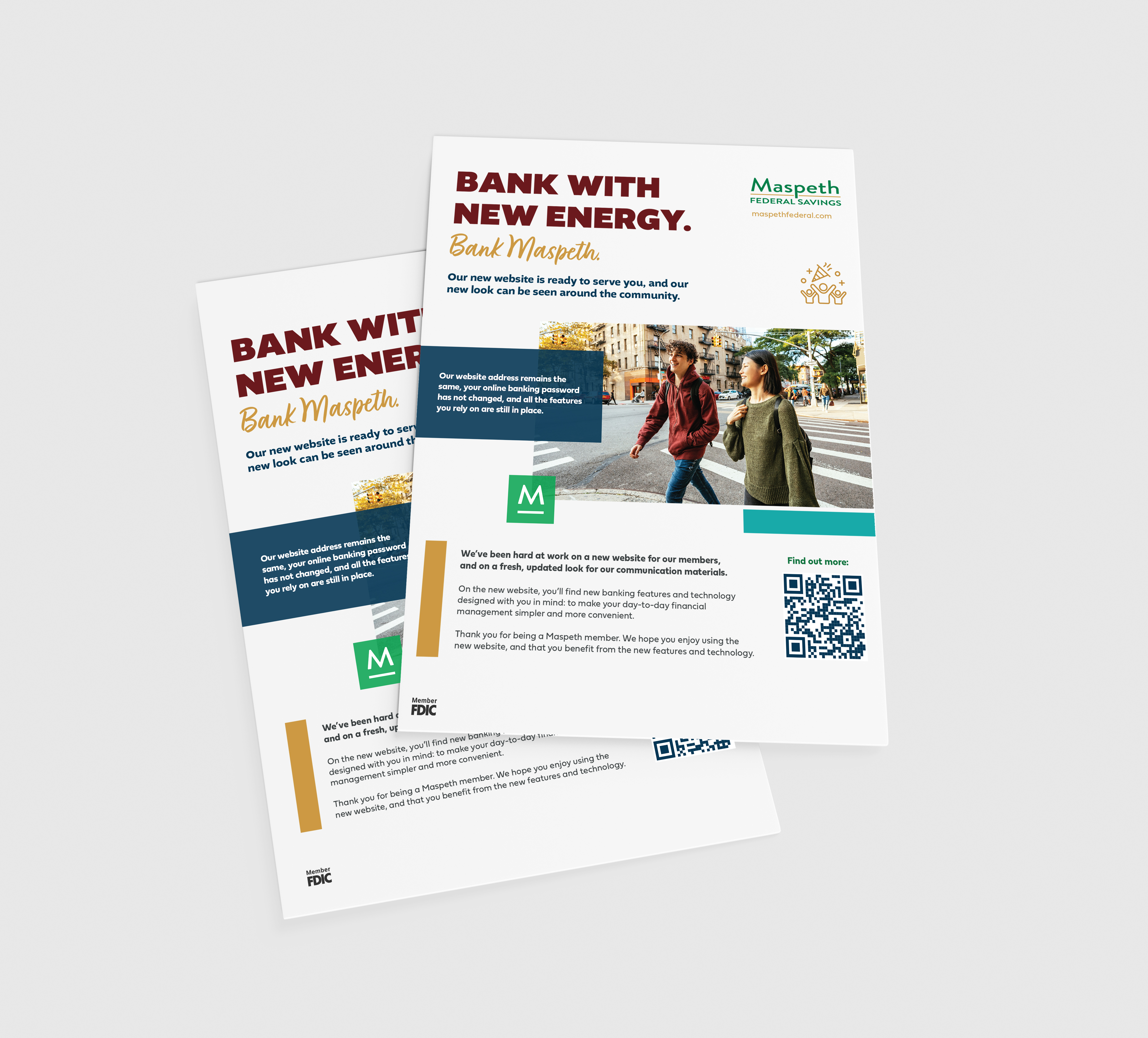
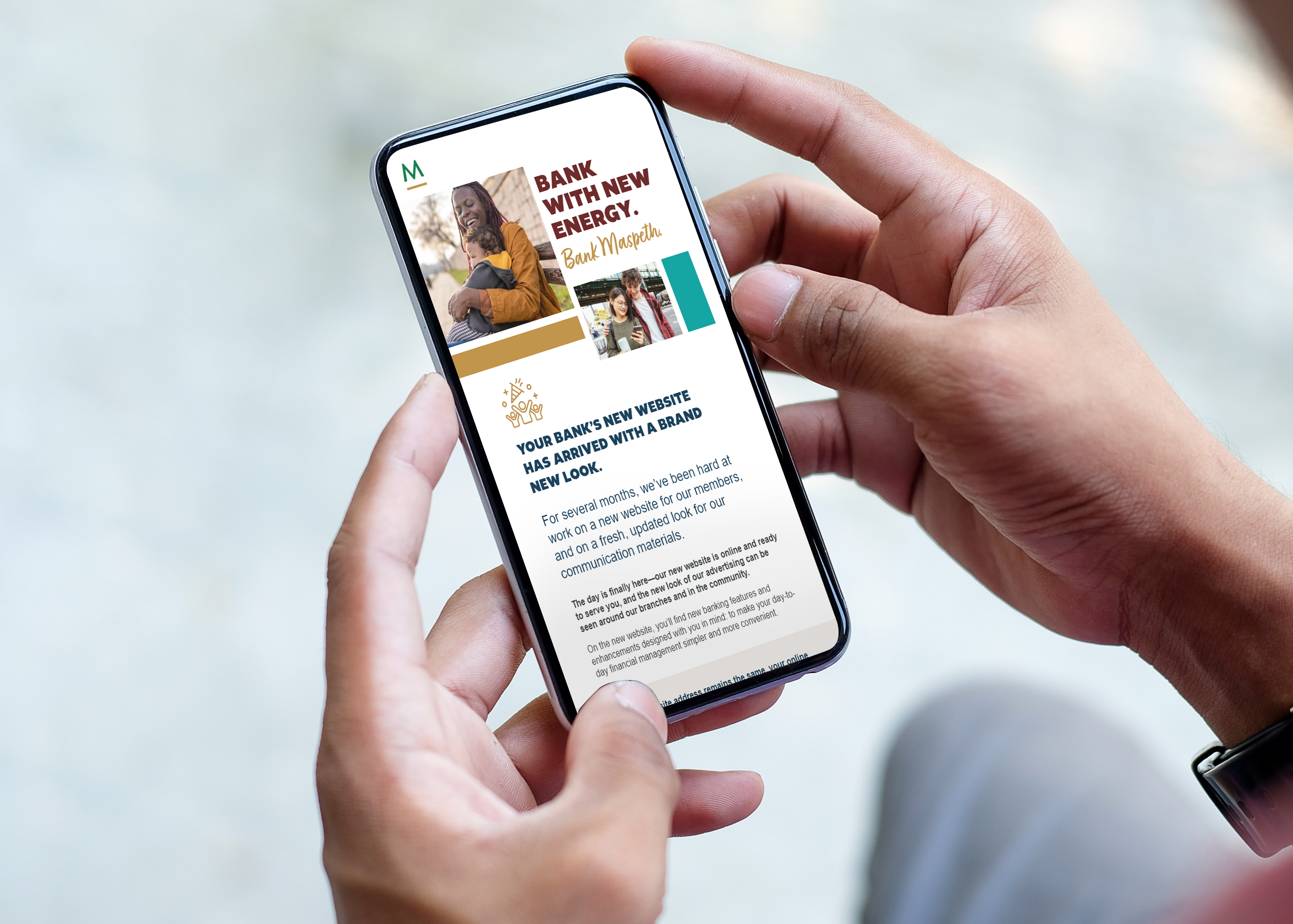
For Maspeth’s new Identity Standards, Pannos took design inspiration from the city streets and neighborhood blocks in the communities the bank serves. Working with the idea of parts that create a whole, the design features a grid pattern with overlapping color blocks and images to create a lifestyle collage. Each collage represents a moment in time at an MFS branch or in the lives of MFS members. The overall pattern connects those moments to tell a bigger story.
Copy guidelines literally set the tone for Maspeth’s enhanced brand, born from the distinctive qualities that set the bank apart. The tone expresses the bank’s community-minded, big-hearted essence. Using key descriptors like genuine, caring, down-to-earth, and fun, the voice and value of Maspeth came to life. Brand copy features a headline structure that is at once recognizable and flexible, and ultimately reaches out to new audiences.
To generate pre-launch excitement, we got the word out with landing pages, eBlasts, branch hand-outs, digital ads, and other materials that made the unveiling of the new brand a true event. Once the refreshed brand went live, our digital and traditional advertising strategy ensured that everyone in the community got a look at the new Maspeth.
The logo is at the heart of the Maspeth Brand. The M is the hero element, connecting to the Queens community and leading the bank and its neighbors forward.
For Maspeth’s new Identity Standards, Pannos took design inspiration from the city streets and neighborhood blocks in the communities the bank serves. Working with the idea of parts that create a whole, the design features a grid pattern with overlapping color blocks and images to create a lifestyle collage. Each collage represents a moment in time at an MFS branch or in the lives of MFS members. The overall pattern connects those moments to tell a bigger story.
Copy guidelines literally set the tone for Maspeth’s enhanced brand, born from the distinctive qualities that set the bank apart. The tone expresses the bank’s community-minded, big-hearted essence. Using key descriptors like genuine, caring, down-to-earth, and fun, the voice and value of Maspeth came to life. Brand copy features a headline structure that is at once recognizable and flexible, and ultimately reaches out to new audiences.
To generate pre-launch excitement, we got the word out with landing pages, eBlasts, branch hand-outs, digital ads, and other materials that made the unveiling of the new brand a true event. Once the refreshed brand went live, our digital and traditional advertising strategy ensured that everyone in the community got a look at the new Maspeth.
Results
Maspeth Federal Savings is still the bank that generations of New Yorkers have relied on for financial advice and success. Now, with a contemporary brand look and brand message, the bank is reaching new customers, and is ready to move into the future and continue its legacy of partnership and prosperity for generations to come.
Like what you see?
We can do the same for you.