
February 20, 2020
What if there was a way to improve your landing pages based upon where people are truly engaged and not just where they’re clicking?
That is exactly what heat mapping does for you! Instead of judging your landing page only on where visitors are clicking, it allows you to track what content they are actually seeing and engaging with.
You may be asking yourself ”what is heat mapping?”. The short answer is, it is exactly what it sounds like. It maps out the “hot” areas of a page, which is where the majority of visitors are spending their time, all the way down to the cool colors (blue) where people are leaving or disengaging. Heat mapping provides actionable data that can be used to optimize your landing page and make the necessary adjustment to put you in the best position to achieve a conversion.
Having a landing page that grabs, and keeps, visitor interest is the best way to optimize for conversions. So, how do you do this? Start above the fold. A throwback to the days when people still read newspapers (the paper version), above the fold refers to the part of the page that shows when you first land on the page. Having a call to action above the fold along with engaging content helps retain visitors and keeps them on your page longer. It doesn’t stop there, however. Additional engrossing content and calls-to-action will help to drive the visitors further down the page, increasing the chances that they will convert.
The following two images show the stark differences between a landing page that has optimized content and calls-to-action versus one that does not.
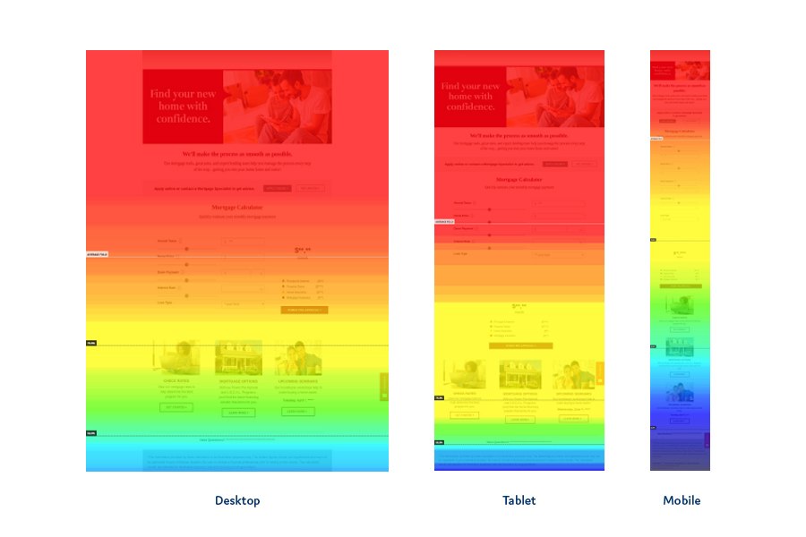
On the first landing page you can see a main CTA above the fold, as well as just a hint of the mortgage calculator. As many mortgage customers are wondering “can I afford this?”, the calculator pulls you further down the page. This page retained 75% of visitors to below the calculators, the yellow/green zone, and 50% to the bottom of the page, the green/blue zone. This page is optimized to convert visitors.
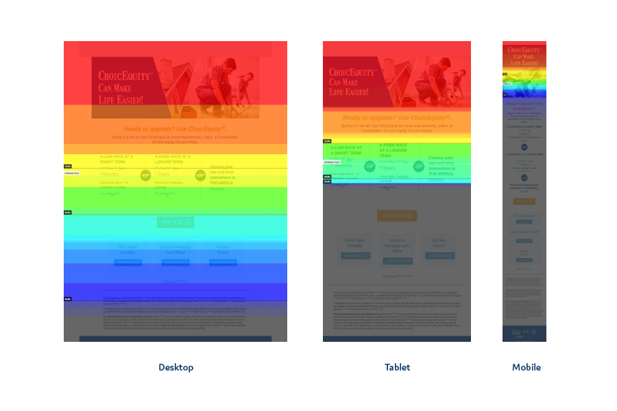
The second page is the other end of the spectrum. The above-the-fold real estate is primarily taken up by a large image with no call to action. As a result, you can see how quickly the map changes colors as the visitors leave the page. By the time we make it to the first call to action less than 25% of visitors are still on the page. This is a great example of how you can utilize heat mapping to redesign and optimize your landing pages.
We have found that, on average, 60% of landing page traffic comes from mobile devices, and when you provide calls to action above the fold across all 3 platforms (desktop, tablet, mobile), you have an 83% chance of receiving a call to action.
As you think about your digital marketing efforts, the landing page is crucial to driving the consumer to action. Why wouldn’t you want to optimize the placements of your calls-to-action and content to ensure visitors are engaged? When you do heat mapping, you have this ability! It gives you the power to look at how your landing page is performing and optimize for conversions.
In the amount of time it took to read this blog you could have had heat mapping installed on your own landing page!
You may be asking yourself ”what is heat mapping?”. The short answer is, it is exactly what it sounds like. It maps out the “hot” areas of a page, which is where the majority of visitors are spending their time, all the way down to the cool colors (blue) where people are leaving or disengaging. Heat mapping provides actionable data that can be used to optimize your landing page and make the necessary adjustment to put you in the best position to achieve a conversion.
Having a landing page that grabs, and keeps, visitor interest is the best way to optimize for conversions. So, how do you do this? Start above the fold. A throwback to the days when people still read newspapers (the paper version), above the fold refers to the part of the page that shows when you first land on the page. Having a call to action above the fold along with engaging content helps retain visitors and keeps them on your page longer. It doesn’t stop there, however. Additional engrossing content and calls-to-action will help to drive the visitors further down the page, increasing the chances that they will convert.
The following two images show the stark differences between a landing page that has optimized content and calls-to-action versus one that does not.

On the first landing page you can see a main CTA above the fold, as well as just a hint of the mortgage calculator. As many mortgage customers are wondering “can I afford this?”, the calculator pulls you further down the page. This page retained 75% of visitors to below the calculators, the yellow/green zone, and 50% to the bottom of the page, the green/blue zone. This page is optimized to convert visitors.

The second page is the other end of the spectrum. The above-the-fold real estate is primarily taken up by a large image with no call to action. As a result, you can see how quickly the map changes colors as the visitors leave the page. By the time we make it to the first call to action less than 25% of visitors are still on the page. This is a great example of how you can utilize heat mapping to redesign and optimize your landing pages.
We have found that, on average, 60% of landing page traffic comes from mobile devices, and when you provide calls to action above the fold across all 3 platforms (desktop, tablet, mobile), you have an 83% chance of receiving a call to action.
As you think about your digital marketing efforts, the landing page is crucial to driving the consumer to action. Why wouldn’t you want to optimize the placements of your calls-to-action and content to ensure visitors are engaged? When you do heat mapping, you have this ability! It gives you the power to look at how your landing page is performing and optimize for conversions.
In the amount of time it took to read this blog you could have had heat mapping installed on your own landing page!


