Logo Refresh
Overview
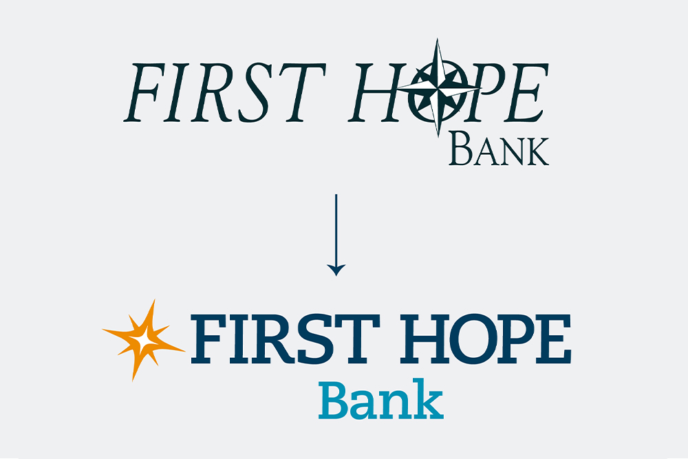
First Hope Bank is relentlessly driven to build tradition. While they are committed to time-honored standards, they wanted a logo that reflects their dedication to solving today’s challenges and their forward-reaching action to shape tomorrow’s successes.
Project Goals
The bank wanted a new logo that firmly establishes their presence as a modern, innovative financial institution, deeply rooted in serving its community and providing intense care and focus on the needs of its customers.

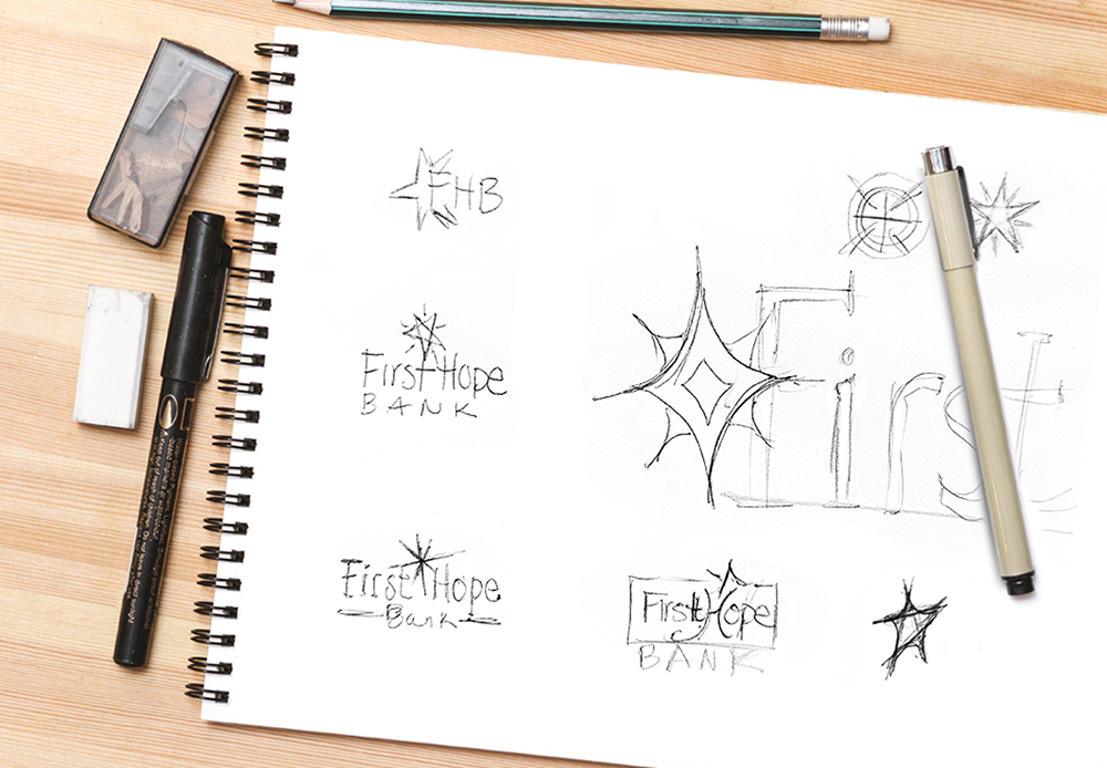
The Process
While the bank was ready to modernize their logo, they wanted to keep a classic and refined look. The chosen colors are clean and contemporary. Keeping the star as an element of the logo represents First Hope Bank’s ongoing commitment to guiding their customers towards financial success. The new typeface is modern and distinct, maintaining clarity and recognition even at smaller sizes.
Like what you see?
We can do the same for you.